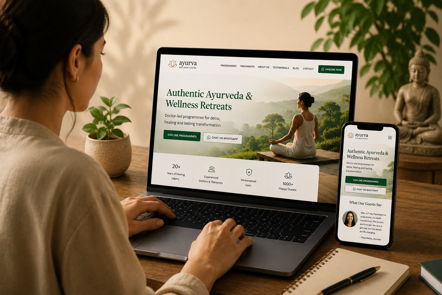
Most wellness centre websites are built to look beautiful, not to convert. Here are the 7 elements that separate a website that works from one that just looks good.
A wellness centre's website is not a brochure. It is not a portfolio. It is not a digital version of a printed flyer.
It is the most important sales conversation your centre will ever have, and it is happening silently, at every hour of the day, with every seeker who types your name into a search engine or clicks your ad.
And yet, the majority of wellness centre websites are built as though they are decorative objects. Beautiful to look at, deeply unhelpful to a seeker who is genuinely trying to decide whether to trust you with their health and their money.
This article is about the difference between a wellness website that looks good and one that actually works.
The Fundamental Mistake Most Wellness Websites Make
Here is the most common pattern in wellness centre websites across India.
The homepage opens with an atmospheric image, perhaps a treatment room, a yoga practitioner at sunrise, a pool surrounded by greenery. Below it, a poetic tagline. "Where Ancient Wisdom Meets Modern Healing." Or "Restore. Rejuvenate. Return to Yourself."
The visitor reads this. It is beautiful. And then they ask themselves: what exactly do you offer? Who is this for? What will this cost? What happens after I enquire?
If none of these questions are answered within the first few seconds, the visitor leaves.
The fundamental mistake is this: wellness centre websites are designed to express the brand's identity, when they should be designed to serve the visitor's decision. These are not the same thing. A website can do both, express your philosophy and serve the seeker's practical needs, but the practical needs must come first.
The 7 Elements of a High-Performing Wellness Website
1. A Specific, Benefit-Oriented Headline
Your headline, the first line of text a visitor sees, should answer the question "What do you offer, and who is it for?" in ten words or fewer.
Weak: "Heal. Restore. Renew." Strong: "Authentic Panchakarma Retreats in Kerala, 7 to 21-Day Programmes"
Weak: "Discover the Power Within" Strong: "Ayurveda Treatment Centre in Pune, Doctor-Led Programmes for Chronic Conditions"
Specificity is not less spiritual. It is more honest. A seeker who lands on your page and immediately understands what you offer is more likely to stay, read, and enquire. A seeker who must deduce your offering from atmospheric imagery will leave.
2. A Clear, Unhidden Path to Enquiry
Your enquiry mechanism, a WhatsApp button, a contact form, a "Book a Consultation" prompt, must be visible on every page without scrolling. It should appear in your navigation, in your hero section, and again at the bottom of every programme page.
The assumption that seekers will find the contact form if they are interested enough is mistaken. Interest fades quickly in digital environments. Every additional step between a seeker and an enquiry costs you conversions.
WhatsApp Business buttons, in particular, are highly effective for wellness centres in India. They are familiar, low-friction, and they allow seekers to ask informal questions before committing to a formal enquiry. A seeker who can type "what does a Panchakarma programme cost?" into WhatsApp at 10 PM is far more likely to become a booking than one who must fill a form and wait for an email response.
3. Social Proof That Feels Real
Trust is the core conversion mechanism in wellness. And nothing builds trust more effectively than evidence of other people's positive experiences.
This means testimonials, but not the polished, single-sentence quotes that appear at the bottom of most wellness websites. Those are largely ignored. The testimonials that convert are specific, detailed, and read like something a real person actually said.
Compare these two:
Weak: "A life-changing experience. Highly recommend!", Priya M., Mumbai
Strong: "I came to the centre with severe psoriasis that I had managed unsuccessfully for seven years with conventional medicine. After a 21-day Panchakarma programme, my symptoms reduced by around 70%. I was genuinely sceptical before I arrived, but the doctor was thorough, patient, and completely transparent about what to expect. I have now been twice.", Priya Mehta, 44, Mumbai
The second testimonial does something the first cannot: it speaks to a specific condition, addresses scepticism, describes the experience, and reports a measurable outcome. A seeker reading this and thinking about their own unresolved health concern will feel understood in a way that no marketing copy can replicate.
Video testimonials are even more powerful. A 60 to 90-second video of a guest describing their journey, unscripted, honest, in their own language, is among the highest-value content a wellness centre can produce.
4. Programme Pages With Enough Detail to Decide
Each programme you offer should have a dedicated page that answers the questions a seeker is actually asking.
These questions include: What does this programme treat? What does a typical day look like? What treatments are included? Who administers the treatments, doctors, therapists, or both? What is the duration and pricing? What is included in the fee and what is not? What should I bring? What should I eat before I arrive?
Most wellness programme pages answer one or two of these questions. The rest are left for the enquiry call, which means that many seekers who needed that information never get as far as making the call.
Detail does not diminish the mystery or magic of a wellness programme. It reduces the anxiety that prevents seekers from committing. A seeker who feels they understand what they are entering is a seeker who is ready to book.
5. Mobile-First Design, Without Exception
The majority of wellness enquiries in India originate on mobile devices. This is not a prediction for the future, it is the current reality.
A website that was designed for desktop and "also works on mobile" is not a mobile-first website. On a mobile-first website, every element, typography, image sizing, button dimensions, form fields, navigation, is designed to be used on a phone screen held in one hand.
According to Google's mobile-first indexing documentation, Google now primarily uses the mobile version of a website for indexing and ranking, making mobile-first design a search visibility requirement, not just a usability preference.
Test your website yourself, on your phone, as a new visitor. Try to find the programme you offer. Try to read the testimonials. Try to submit an enquiry. Notice where you hesitate, scroll unnecessarily, or lose your place. These are the places where seekers are leaving.
6. Page Speed That Does Not Test Patience
A wellness website that takes six seconds to load on a mobile connection is losing a significant portion of its visitors before they see a single line of content.
Page speed is not a technical detail for developers to worry about, it is a direct driver of lead generation. Studies across industries consistently show that conversion rates drop with every additional second of load time.
You can measure your own website's speed using Google PageSpeed Insights, a free tool that scores load time, mobile usability, and Core Web Vitals.
The most common causes of slow wellness websites are large, unoptimised images, unnecessary third-party scripts, and hosting environments that are not sized appropriately. Each of these is solvable.
A fast website feels like a trustworthy centre. A slow website, regardless of the quality of the content behind it, communicates neglect.
7. Organic Visibility Through SEO
A wellness centre website that cannot be found through Google search is entirely dependent on paid advertising for its enquiries. This is an expensive and fragile position.
Search engine optimisation for wellness centres begins with understanding what seekers are actually typing when they look for a programme like yours. "Panchakarma treatment Coimbatore", "Ayurveda retreat for weight loss Kerala", "naturopathy centre Mumbai with accommodation", these are specific searches with high intent. A seeker who types these queries and finds your website is far more qualified than one who saw a general interest ad.
Every programme page, every blog article, every piece of content on your website is an opportunity to appear in these searches. Good SEO for wellness is not technically complicated, it is consistent, specific, and patient.
The Aesthetic Question
There is a genuine tension in wellness website design between the visual atmosphere that communicates your brand's essence and the functional clarity that converts visitors into enquiries.
The resolution is not to sacrifice one for the other. It is to sequence them correctly.
Visual atmosphere creates the emotional context, the sense of calm, quality, and care, that makes a seeker receptive. Functional clarity then provides the specific information they need to decide. These work together when a website is well designed.
The mistake is to prioritise atmosphere so completely that the functional elements are buried, unclear, or absent. Many wellness designers come from graphic or interior design backgrounds and have exceptional aesthetic instincts but limited understanding of conversion behaviour. The result is websites that look extraordinary and perform poorly.
The best wellness websites look beautiful and work hard. These are not competing objectives.
A Website Is a Living System, Not a Finished Product
One of the most common misconceptions about wellness websites is that they are something to be built once and then left alone. A website launch is not the end of the project, it is the beginning.
A well-maintained wellness website is updated regularly with new testimonials, new programme details, blog content, seasonal offers, and improvements based on visitor behaviour data. It is tested continuously, different headlines, different images, different enquiry form placements, to understand what actually drives conversions.
Analytics should be reviewed monthly. Heatmaps that show where visitors click and scroll reveal what is attracting attention and what is being ignored. Enquiry data shows which programme pages are driving the most leads. Bounce rates identify pages where visitors are leaving immediately.
This discipline, treating the website as a system to be optimised rather than an artefact to be admired, is what separates the centres growing through their website from the ones that could not tell you whether their website drives any enquiries at all.
Where to Begin
If your current website is not generating consistent, qualified enquiries, the most effective place to begin is an honest audit.
Ask yourself: if a complete stranger visited my website right now, someone who has never heard of my centre, would they immediately understand what I offer, why they should trust me, and how to take the next step?
If the answer is uncertain, that is where the work begins.
Yogic Verse designs and builds conversion-optimised websites for wellness centres, Ayurveda programmes, yoga institutes, and retreat businesses, combining calm aesthetics with the functional architecture that drives genuine enquiries. Book a free consultation.
Explore our Website Development solutions.

Yogicverse
Want More Wellness Insights?
Explore our blog and articles for the latest in wellness technology and business growth.